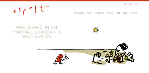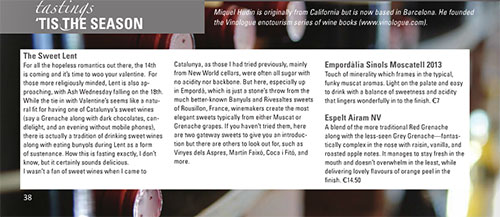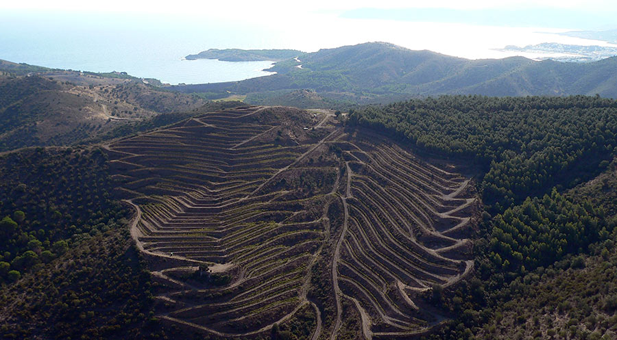
I’ve known the wines of Celler Espelt for a very long time and have talked with director, Anna Espelt on various occasions to the point where I hold a great deal of respect for her and consider her a friend. I mention this because I normally wouldn’t write about something so basic as a website re-launch but I’ve been following Espelt’s digital path for such a long time that their recent re-launch is worthy of note.
Since the birth of websites 20 odd years ago, what most wineries seemed to end up with was something created with Flash. Many people in the early late 1990’s through the early aughts were big fans of the Flash website because they gave a lot of design flexibility that wasn’t available in earlier versions of our ever-evolving web universe. But what they offered in well, “flashiness” they completely lost in terms of flexibility. Most websites that were launched in say, 2002 were then never updated or they were hacked up to have some awkward Flash intro that led in to a more traditional site which could actually be updated as unbeknownst to designers it seems, new wines come out each year and a winery website absolutely must change all the time. That and search engines like Google or, um Bing (is that still around?) just can’t find anything in a Flash website so no one finds wineries easily that use this as their web platform.
This is where Espelt was just a few months ago. Their website was cute and carried their branding that was created by famed designer, Mariscal but it was showing its years badly. It was small in size in an age where web pages fill the screen. It either wouldn’t load or would load incorrectly on mobile devices and tablets. And of course, it was not easy to update. All of this pointed to a change and was on the long to-do list for Anna Espelt when she took over as director of the company two years ago.
Taking all of the failings of the old site in to consideration and looking as to where they wanted to go for the future, they worked for several months to create the new site which was launched in November, 2014. The basic goal, as Anna put it was simple, “To communicate with our clients and lovers of Empordà wines […] as well as convey how we live in the region.”
The new website, in my opinion looks sharp. It isn’t some groundbreaking design, but that’s not the point as usability and good layout are so much more important if what you want to do is convey information about wines and locale. It manages to not depart from their brand identity at all and if I just glance at it, I know that this is Espelt.
They’ve also made a multilingual site which is key to any Catalan winery. While it’s obviously necessary to converse in both Castilian and Catalan in the region, the wineries here export a lot and so English is a necessity as well. They have scaled back the amount of languages slightly though as there were five on the old site which I can imagine to be nothing short of onerous to try and manage. Their French version will be coming soon (Empordà sits right at the border and sees many French speakers) which is yet another advantage of the new site in that they can add and take away languages, pages, sections, and wines as they see fit given that it’s built on a content management system similar to WordPress.
And of course this flexibility is key as they now have an online store, a news section, and other information pages which can hold their most up-to-date versions as possible, which is rarely possible in Flash without contacting the person who originally made it and thus incurring additional costs.
But for me, the most important facet of this new website is that they’ve looked at where their web traffic was coming from (Catalonia and the United States) and how people were viewing the website and created the new version to match it. Beyond the languages, if you look at their website on your desktop, tablet, or even phone, you’ll notice that it looks slightly different to fit that specific device. We call this responsive design and any website that isn’t made with it in mind these days just shouldn’t be made at all as so much traffic, especially for those traveling to a visit a winery is on some form of portable device now.
Ultimately, I tip my hat to Anna, Espelt, and the designers for creating a website that many, many wineries and regions (I’m looking at you, Croatia…) should take note of and strive to create. The tools are out there as you can see that Saó del Coster did something similar in Priorat. Use them, be fruitful, and let the world know about your wines, but just be ready to commit time to updating a website because these days, relevant digital content is to a large degree more important than anything else.


Hola Miquel,
molt bo l’article i gràcies pel resó. Només una correcció important, la web no és WordPress. Tenim el nostre propi gestor de continguts que bàsicament dona més seguretat i flexibilitat que un WordPress.
Salut
Fidel
Merci, està corregit.